

To mark 15 years of supporting Canada’s startup ecosystem, Capital Angel Network partnered with us to evolve their brand. This milestone presented an opportunity to reflect on CAN’s impact while repositioning the group for its next era of growth. Through updated design systems, event branding, and commemorative assets, we crafted a solution that balances legacy with forward momentum.
Capital Angel Network has helped shape the early-stage investment landscape in Ottawa and beyond. As the organization celebrated its 15th anniversary, it needed a refreshed identity that would honour its past while energizing its visual presence. The goal: create a design system that reflects credibility and growth, with space to evolve as CAN’s mission expands.
We approached the challenge by building a flexible, scalable logo system that could adapt to various uses across print, digital, and event-based materials. A key part of the solution was the introduction of an anniversary emblem designed to complement the core logo without competing for attention. Alongside this, we developed cohesive visuals for presentation decks, patterns, and supporting assets, ensuring CAN had everything needed to roll out their refreshed look across channels confidently. You can check out how the brand applies to video work created by the seoplus+ team here. (link to video portfolio entry)
We approached the challenge by building a flexible, scalable logo system that could adapt to various uses across print, digital, and event-based materials. A key part of the solution was the introduction of an anniversary emblem designed to complement the core logo without competing for attention. Alongside this, we developed cohesive visuals for presentation decks, patterns, and supporting assets, ensuring CAN had everything needed to roll out their refreshed look across channels confidently. You can check out how the brand applies to video work created by the seoplus+ team here. (link to video portfolio entry)
We approached the challenge by building a flexible, scalable logo system that could adapt to various uses across print, digital, and event-based materials. A key part of the solution was the introduction of an anniversary emblem designed to complement the core logo without competing for attention. Alongside this, we developed cohesive visuals for presentation decks, patterns, and supporting assets, ensuring CAN had everything needed to roll out their refreshed look across channels confidently. You can check out how the brand applies to video work created by the seoplus+ team here. (link to video portfolio entry)
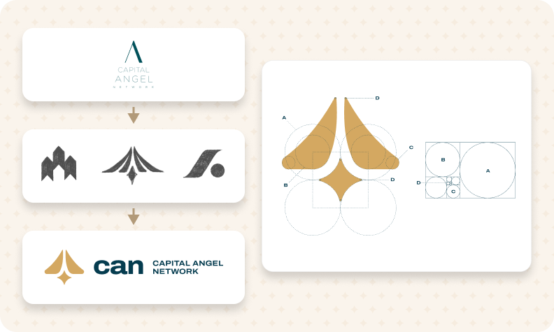
At the core of the rebrand is a bold and intentional mark built around the concept of an ascending path. This visual metaphor speaks to momentum, growth, and the journey from idea to impact. The “A” shape functions as both an abstract monogram and a symbol of forward motion, subtly inspired by the trajectory of founders and the energy of angel investing.
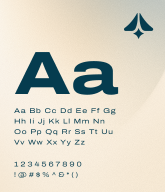
The concept was brought to life through a modular logo system constructed using geometric principles and golden ratio alignment, giving it both structure and consistency. Each variation, from full lockup to icon-only, was tested for clarity at small sizes to ensure the brand remains legible and recognizable across all touchpoints, including pitch decks, email signatures, and print assets.
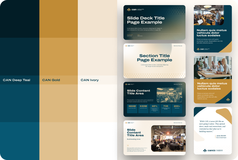
The selected color palette reflects thoughtful optimism and the kind of long-view energy essential in early-stage investing. The golden-orange accent evokes a sense of warmth and confidence, like the horizon at sunrise. It represents human-centred growth, value creation, and a sense of forward movement that aligns with the spirit of the Capital Angel Network.
The deep teal navy draws inspiration from the organization’s existing palette, grounding the system in brand familiarity while maintaining a refined, flexible tone for both serious and celebratory uses. Paired with a soft neutral light, the result is a fresh and modern palette that balances purpose with emotion. It captures the belief in progress while staying grounded in people.
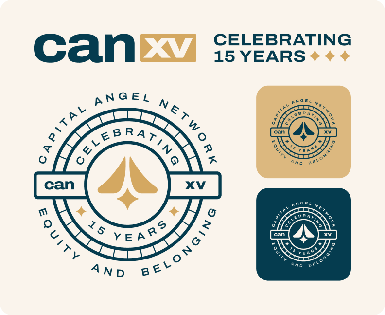
To mark a major milestone in Capital Angel Network’s journey, a commemorative 15-year anniversary logo system was developed. Designed for both horizontal and badge-style applications, the logo maintains clear hierarchy and legibility while adding a meaningful visual element to brand communications during the anniversary period. The use of Roman numerals reinforces the historic significance of the moment and adds a subtle layer of sophistication.
This celebratory mark blends seamlessly into the visual system while still standing apart as a special identifier. It serves as a visual reminder of the organization's legacy of equity, belonging, and bold community support. It acknowledges the past while remaining firmly oriented toward the future.
“seoplus+ delighted Capital Angel Network with their brand development process and outcome. After 15 years of operations we engaged seoplus to refresh our brand to meaningfully reflect where we are going as an organisation. The final brand was delivered beyond our expectations - timeless, capturing our values, distinctive, bold, emotive, thoughtful, storied and world class. The new brand is a point of pride for our membership and Board leaders.”
– Suzanne Grant
Executive Director, Capital Angel Network


Our design team will review your brand and provide actionable tips to help make it more memorable! 100% free & no-obligation!