

Aetna Pest Control, a well-established company specializing in termite and structural pest management, needed a new identity that matched its reputation for reliability. The goal was to create a modern brand that communicated expertise, protection, and professionalism while keeping the honesty and approachability customers already knew.
Aetna had built years of credibility through dependable service, but its logo and visual system felt dated and overly local. The team wanted a refreshed identity that would position them beside national competitors while maintaining their small-business integrity. The new direction needed to look confident, modern, and grounded in the company’s leadership in advanced termite technology through Sentricon.
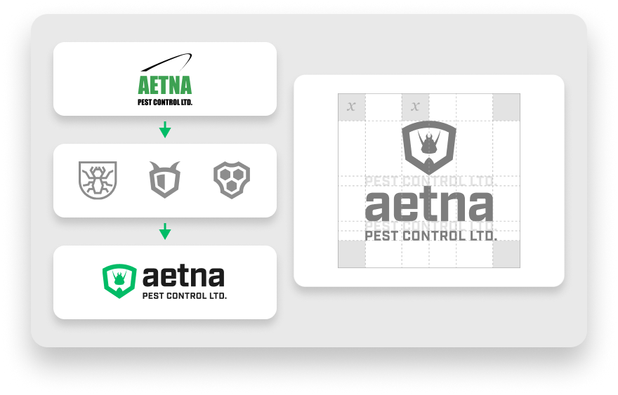
The new identity focused on elevating Aetna’s reputation without losing its personality. Every design choice centered on clarity, balance, and trust. The logo was redesigned to capture a sense of protection and precision, using bold geometry and a subtle insect form contained within a shield.
This symbol became the cornerstone of the new visual system. Paired with refined typography and a clear colour palette, it allowed Aetna to project strength and reliability across every channel, from uniforms to digital platforms.
The new logo centers on a geometric shield that instantly conveys reliability and protection. Within it, a stylized insect shape hints at Aetna’s area of expertise without feeling literal. The design works equally well as a standalone mark or paired with the wordmark, creating flexibility across brand materials.
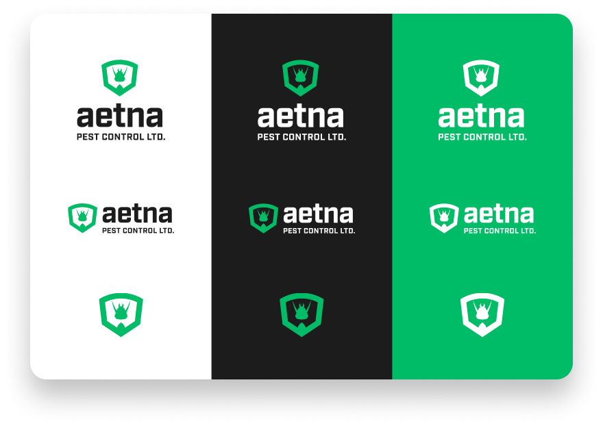
The brand’s palette combines a vivid green with deep charcoal and crisp white. Green represents growth and expertise, while the darker tones provide balance and strength. The simplified three-colour system makes the brand easy to recognize and consistent across every application.
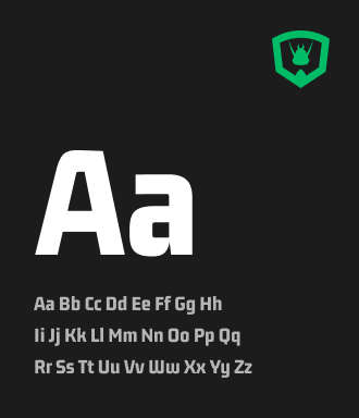
Headings use Gemunu Libre, a bold geometric font that commands attention. Body text is set in Geist, a clean and approachable sans-serif. The lowercase wordmark reinforces a sense of calm confidence, helping the brand feel both professional and human.

"This project was about translating trust into design. Aetna already had the reputation. The goal was to give them an identity that looked as strong as the work they stand behind."
– Brian Warren, Art Lead,
seoplus+


Our design team will review your brand and provide actionable tips to help make it more memorable! 100% free & no-obligation!